Hey Guys...It's awesome to hear from you once more. It has definitely been a long time. As from what I know from before your works has never ceased to impress me. Everytime there is something new and wonderfull to see. More power to you guys!
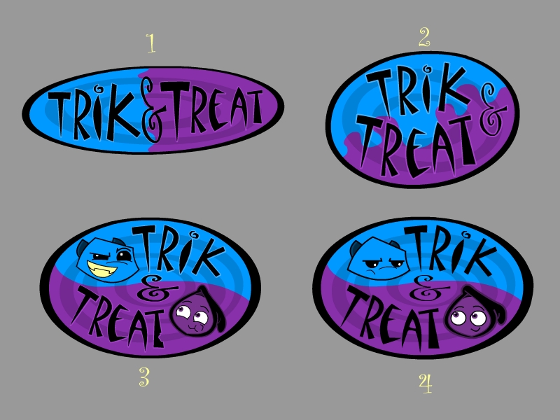
Number 3 is definately my favourite. The swapped colours from number 4 make the characters stand out a lot more. The expressions also show a little more about the characters' personalities than they do in number 5.
The wavy transition between the two background colours in number 2 draws my attention away from the actual text which isn't a good thing. Number 1 is nice and simple and would be good for an actual logo on paper or whatnot, but I think number 3 would make the best logo to appear at the start of an animation.


5 Comments:
I personally like number one. It's simple and doesn't distract you from the title with the character art.
Hey Guys...It's awesome to hear from you once more. It has definitely been a long time. As from what I know from before your works has never ceased to impress me. Everytime there is something new and wonderfull to see. More power to you guys!
Rob
I like # 3 too -- the contrast makes it easier to see your characters - a little teaser of something devilish to come!!
Sheila (aka - mom!)
Number 3 is definately my favourite. The swapped colours from number 4 make the characters stand out a lot more. The expressions also show a little more about the characters' personalities than they do in number 5.
The wavy transition between the two background colours in number 2 draws my attention away from the actual text which isn't a good thing. Number 1 is nice and simple and would be good for an actual logo on paper or whatnot, but I think number 3 would make the best logo to appear at the start of an animation.
Lookin good.
Mike
I like numbers 1,2 and 3 :)
Very cute!
jesi
Post a Comment
<< Home